As we’ve discussed already, we eat with our eyes first. The appearance of a dish can greatly influence our appetite, and colour plays a particularly important role. This week, let us explore the role of colour in food, ranging from the aesthetic to the psychological.
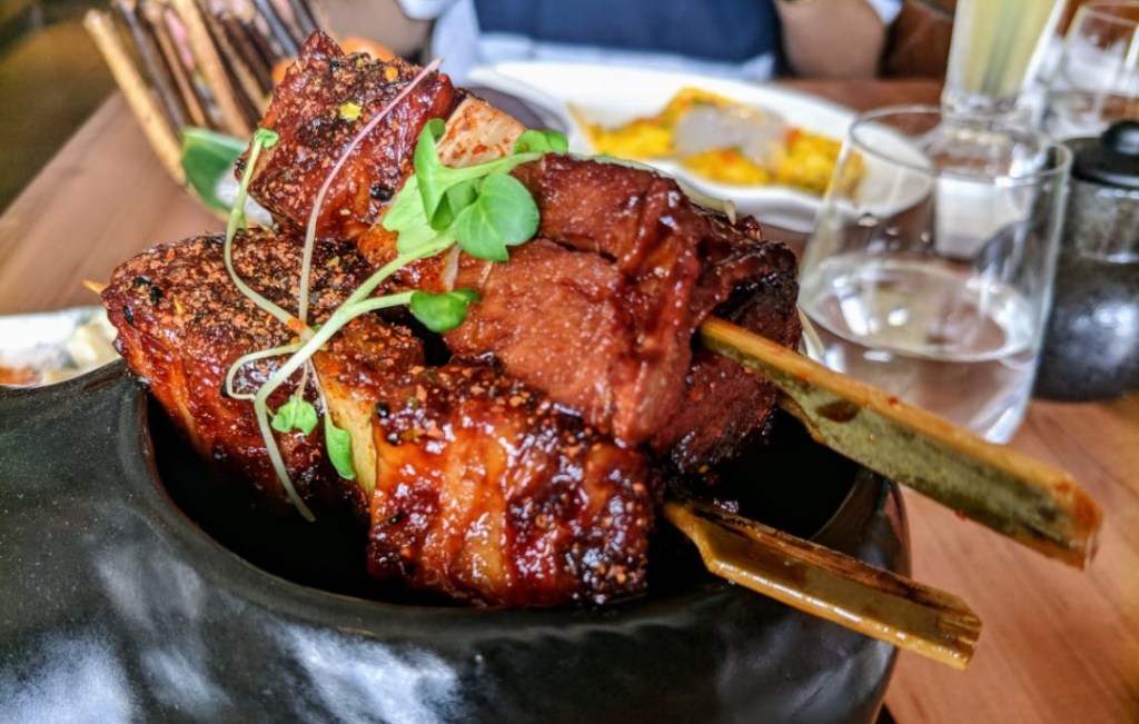
Let’s start with the obvious. Just as a beautiful garden, adorned with flowers of all hues and shapes, is a pleasant sight, similarly a dish whose colours pop from the plate seems particularly appealing. Think of the green coriander leaves garnishing a fiery red lamb rogan josh, mustard greens adorning reddish-brown cubes of pork belly or a delightfully colourful bowl of Korean bibimbap with its myriad of colourful components. The variety of colours engages our eyes first and encourages us to dig in. This colour contrast can be taken a step further by being judicious in our choice of plates. A white panna cotta, for example, stands out beautifully against the background of a black plate.

Some ingredients are added primarily for their colour. A good example would be turmeric powder in Indian cooking and fresh turmeric in a lot of southeast Asian spice pastes. Annatto is an orange-red condiment derived from seeds of the achiote tree, native to Latin America. It is used in numerous Mexican dishes. Italians liberally use squid ink in their pasta which gives them a jet-black colour. All of these impart not only colour to a dish, but also their own distinct flavour.
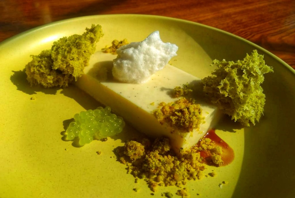
However, another group of chefs is going down the opposite route and making monochrome dishes. The miso panna cotta from the Fatty Bao, whose unusual flavour profile we’ve discussed at length in a previous article, is also a good example of a monochrome dish, in which almost everything on the plate including the plate itself lay on a spectrum of yellows and greens. Think of Picasso’s “The Blue Guitarist” or a pencil sketch, with its myriad shades of grey. It is this minimalism which gives monochrome dishes their simple yet complex visual appeal, confined within a limited range of the colour wheel yet pushing far beyond it.

There is a lot more to colour than mere aesthetics, though. A study was conducted in the University of Bordeaux, France where 54 skilled wine students were asked to taste two wines, a white and a red, and note down the flavour elements they identify. What they didn’t know was that they were both the same wine, a white wine, with some flavourless red food colour added to one glass. Yet the tasters could “pick up” flavours of berries from the red glass. Were they cheating? Maybe, but most likely not. The truth is that you not only eat with your eyes first, you also eat what you see.
Some flavours are associated with certain specific colours in our mind. The strawberry candy is always red; the pineapple, yellow. To realise just how strongly our brain associates colours with flavours, we need to examine a dish by the British Chef Heston Blumenthal. It is a palate cleanser, and on the menu it reads “orange and beetroot jelly”. Fair enough, nothing mind-blowing so far. The “dish” comprises two nondescript squares of jelly, one of them a bright crimson, the other a gentle sunset yellow. Let’s say you decide to go with the savoury beetroot first. You pick up the crimson piece, and take a bite.

Immediately you realise that something is wrong. It doesn’t have the earthiness of a beetroot. Rather, it tastes quite sweet and tart, almost citrusy… kind of like an orange. Confused, you take a sip of water to cleanse your palate and take a bite of the other jelly. And there it is, the beetroot. You rub your eyes, scratch your head and wonder what’s wrong. It feels like someone swapped the flavours of the two jellies.
It isn’t the flavour that has been swapped, but the colour. Heston’s beetroot jelly is made with a yellow variety that doesn’t have the distinctive red colour, and the orange jelly is made with blood orange, a citrus with some notes of berry flavour and a bright, crimson hue, as if stained with blood. But our minds are so conditioned that we see red and think beetroot, and see orange and think, well… orange! Our eyes create an expectation of what we are going to eat, and if that expectation is not fulfilled, it messes with our heads, in a fun way.
So yes, the role of colour in our eating experience in undoubtedly crucial, going far beyond the realm of aesthetics into pure psychology. It is fun, and frankly a little mind-boggling. We will further the discussion of culinary optical illusions in our next part of FATS, so don’t miss it. Tune in next week for yet another on Food Art November article.
2 Comments Add yours